

Overview:
I redesigned the Boston MBTA app to enhance the commuter experience during peak hours, by introducing a smarter, more efficient system that promotes decongestion and ease of travel. This allows commuters to have a better experience as they ride the T.
TIMELINE
2 Weeks
Tools
Figma
Notability
01: Contextual Research
Audience: This project targets Boston MBTA commuters, especially employees who rely on the T to get home after work. Overcrowded trains and delays during peak hours can make these journeys stressful, cutting into time with family and personal relaxation.
The app offers discounted tickets for off-peak travel, encouraging commuters to shift their schedules and reduce peak-hour congestion. By providing an easy way to see discounted time slots and potential savings, the app aims to create a smoother, more predictable commute for all, enhancing the experience for both off-peak and peak-time riders alike.


02: Design
Original Sketch: This was my first iteration of a rough wireframe that I briefly sketched out to better scope how I wanted the interface to look like when buying tickets. I wanted it to be intuitive to what riders of the T were already use to.
Lo-Fi Frames: To build off of my original sketch, I sketched on my iPad with notability. Instead of the discounted prices being red, I wanted to make the UI better and decided on the original price slashed at the bottom of the discount.


Essential Workers
Students
Office Employees
Tourists
Healthcare Workers
Event-goers
Competitor Analysis: I sought inspiration from other forms of transit apps such as Apple Maps, Waze, the current MBTA map, & Google Maps. I wanted to see how they mapped congestion and the organization of their ticketing.
As a user, I also went through the motions of navigating the map and buying a ticket as inspiration. I wanted to see what felt intuitive in order to implement into my prototype.
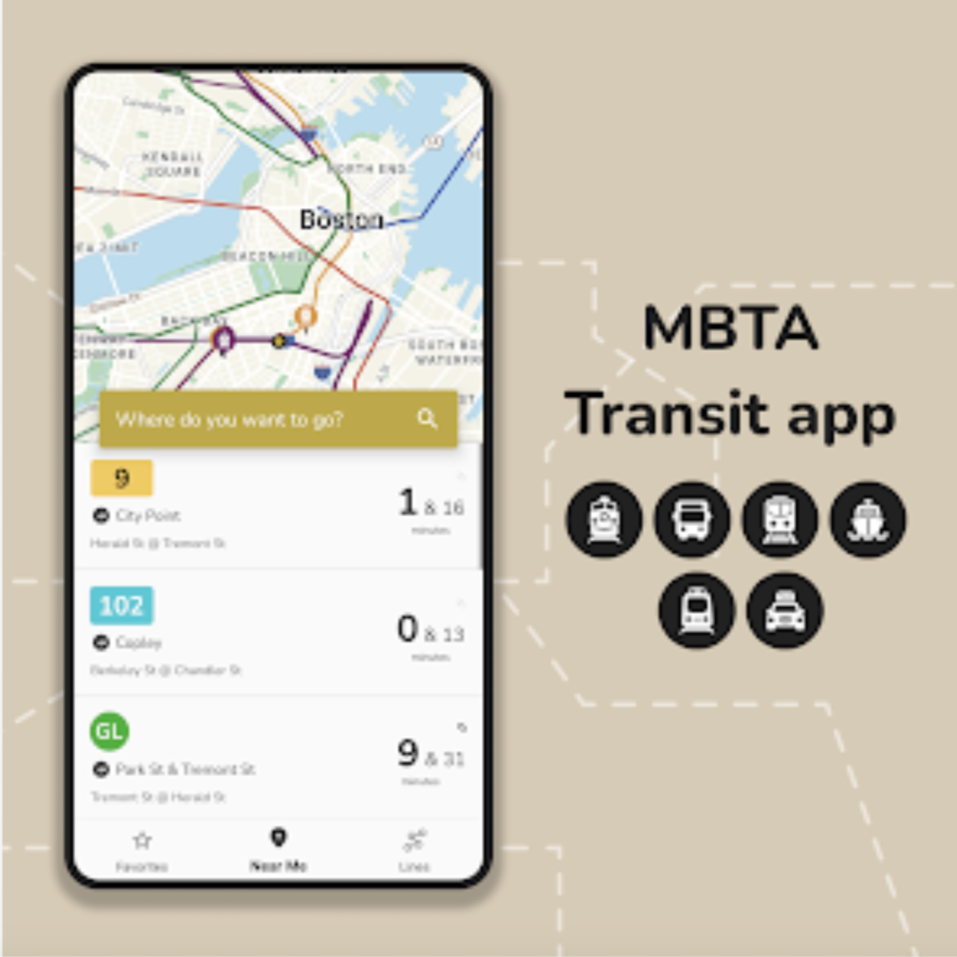


Prototype: First, users will be at their profile page once they open the new MBTA map. From here, in order to see discounted fare tickets, users will click on the discount icon on the bottom dashboard.
I chose the blue color base since it matches the brand identity color on their website and I wanted my prototype to be visually coherent with their already existing site. The line colors were chosen as a modern and colorful addition in order to make it easier it easier to navigate by associating the line color with the colors they see on the screen.


03: Final review & takeaways
In the future, I would want to expand on other methods to encourage riders to ride during non-peak hours. I would like to implement a gamification rewards system where every ticket bought during non-peak hours gives users a certain amount of points. After a certain number of times, they are able to either have enough to cash out as a free T ticket or continue saving up for more! As a consumer, when businesses employ this practice, I feel encouraged to continue engaging with them and their products.
I want to implement a screen that provides more guidance on the discounted fares program for users such as a Q&A in order to learn when and how the discounted fares will run.
From this project alone, I gained valuable insight into user research, user feedback, and competitor analysis, and especially took the time to flesh out my ideas during the process. Before, I would immediately jump into my work but I learned my best work comes when I carefully iterate through each step in order to not miss crucial details! In my free time, I will continue to iterate on my designs to make it visually better especially experimenting with different type and the multitude of interfaces I can do to aid MBTA Flow.